
🧠 Problem Statement
There are over 6 million deaf and speech-impaired people in India, yet they remain excluded from the online dating landscape. Current platforms fail to provide inclusive experiences that cater to visual and non-verbal communication needs.
🎯 Objective
Design an inclusive dating app that empowers deaf and speech-impaired individuals to form genuine connections—without relying on spoken or written language.
🔍 Research
👤 Understanding the Users
I began by familiarizing myself with the lifestyles, challenges, and communication preferences of:
People who can’t hear
People who can’t speak
People who can’t hear and speak
📚 Primary & Secondary Research Insights
Many users understand basic alphabets but rely more on visuals, facial expressions, and sign language.
Reading proficiency varies; hence, text-heavy UIs can become barriers.
Users feel alienated by platforms that don't recognize Deaf culture.
Representation, sign language avatars/videos, and gesture-based interfaces are preferred.
Sources included:
Academic articles, accessibility blogs, and inclusive design research papers from St. Andrews
University, Springer, and others.
🔎 Benchmarking
Reviewed existing apps like:
Glimmer
Hiki
Sign language learning platforms
Observation: No existing dating app truly catered to the nuanced communication and cultural needs of the Deaf community. I therefore referenced Bumble and Hinge for structural inspiration, while evolving the experience around visual-first interactions.
😓 Identified Pain Points
Communication barriers and incompatible preferences
Lack of respect or understanding of Deaf identity
Profiles treating deafness as a flaw
Difficulty finding partners fluent in sign language
Limited options for emotional expression through text
💡 UX Solutions
Big, clear fonts and minimal text
Sign language mascot/avatars for translations
Visual onboarding with icons, gestures, and videos
Inclusive language promoting confidence and identity
Video-based help or interaction cues
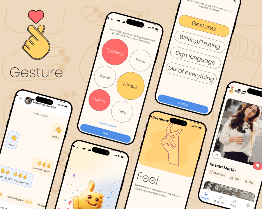
🔄 User Flow
Designed a smooth, low-friction onboarding and matching experience:
Simple splash screen & value props
Visual Q&A to understand communication style and interests
Optional login to reduce friction
Profile suggestions with full visual clarity
Matchmaking and gesture-based chatting
(Include screenshots of user flows and wireframes here)
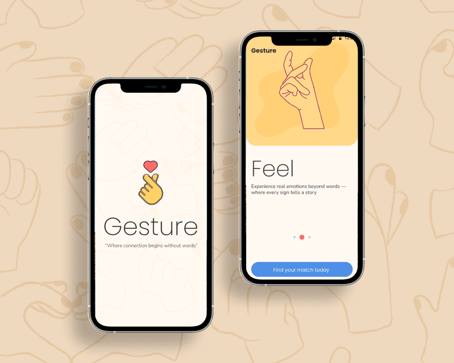
🎨 UI Design
Moodboard
Aimed for a romantic yet calming tone—using soft colors, round edges, and expressive imagery.
Visual Highlights
Option 1 UI chosen for being emotionally resonant and easier on the eyes
Emphasis on connection through expression, not words
Sections: Connect, Feel, Belong—tailored to reflect emotional depth beyond language
(Include images of the final UI screens and microinteractions)
📱 Prototype
Live Figma link: Gesture Prototype
🙌 Outcome
Gesture isn’t just a dating app—it’s a bridge for expression. A safe space where silence doesn’t mean invisibility, and every gesture speaks volumes. It redefines how technology can empower communities often left behind.
🧠 Learnings
Designing for unfamiliar user needs requires humility, empathy, and constant iteration.
Inclusivity isn't optional—it needs to be baked into the product’s foundation, not tacked on.