📌 Project Context
The goal was to redesign the credit card payment flow in Google Pay to make it more intuitive and frictionless — encouraging users to choose credit card payments over UPI. The focus was on improving the user experience while ensuring speed, clarity, and trust throughout the journey.
🔍 Design Process
Investigate → Define → Brainstorm → Prioritize → Design
1. 🕵️ Investigate
I began by understanding user behavior, pain points, and motivations behind using (or avoiding) credit card payments on Google Pay.
What users really wanted:
Convenience: A fast, hassle-free way to pay without entering card details each time
Rewards: A way to track and benefit from credit card rewards
Security: Assurance that card information is protected
2. 🧠 Define
I created quick story-based scenarios to articulate core user needs:
When I’m at a store, I want to scan and pay quickly so I don’t have to fumble with my wallet.
When shopping online, I want to pay securely without re-entering my card details.
When traveling, I want to leave my physical card behind and still be able to pay confidently.
3. 💡 Brainstorm
Over a 2-day sprint, I explored potential ideas and user expectations by:
Digging through forums (Quora, Medium)
Reading UX case studies and articles
Taking notes on design patterns in other fintech apps
4. 🗂️ Prioritize
With lots of raw insights, I moved to identify what really mattered:
Mapped pain points, wants, and needs
Sorted recurring themes using card sorting
Prioritized features like easy discoverability, step clarity, and security prompts
5. ✏️ Design
Once clear on user needs, I focused on building a clean, accessible UI flow:
Designed with a mobile-first approach
Skipped heavy systems to stay agile — kept UI modular but light
Used Material You principles for visual consistency and platform alignment
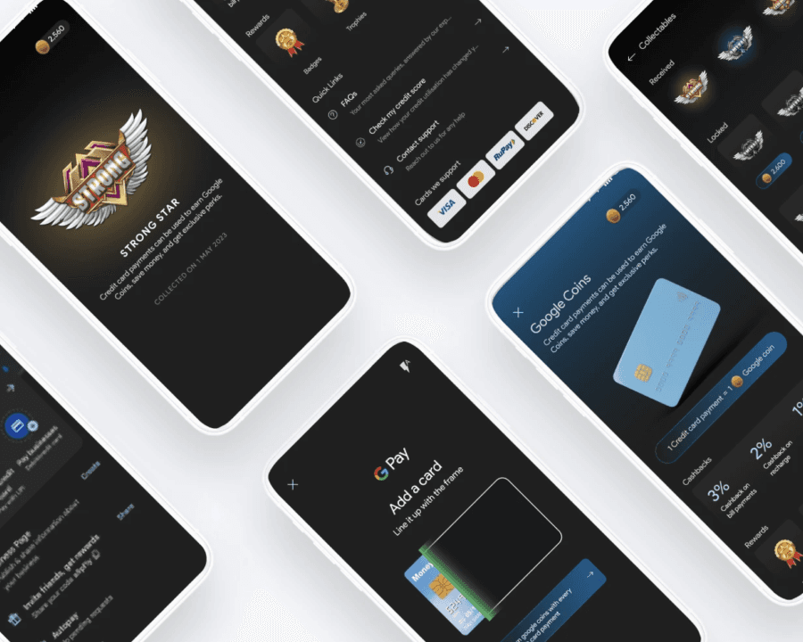
Highlighted key changes like CTA clarity, progress feedback, and simplified steps