Project Context
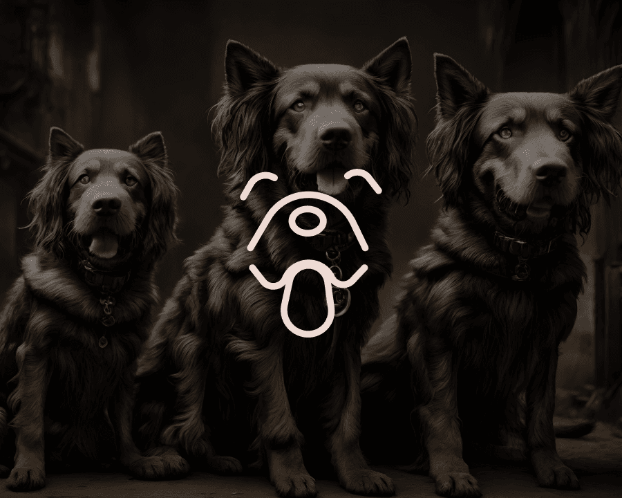
PAWSITIVE is more than just a pet-focused digital brand — it’s a personality. The objective was to build a complete visual identity system that reflects the brand’s core values: Friendly, Secure, Proud, and Bold. From logos to business cards to app icons, every touchpoint was crafted to ensure consistency, clarity, and charm.
My Approach
The identity system for PAWSITIVE was designed to be as lovable and dependable as the pets it represents. I took a modular approach to branding — combining playful design language with structured brand systems. The goal was to create a memorable visual identity that works across print, digital, and merchandise, without losing its energy or emotion.
Vision & Strategy
The vision behind PAWSITIVE’s branding was clear: create something joyful yet trustworthy — a system that communicates warmth without sacrificing professionalism.
To achieve that:
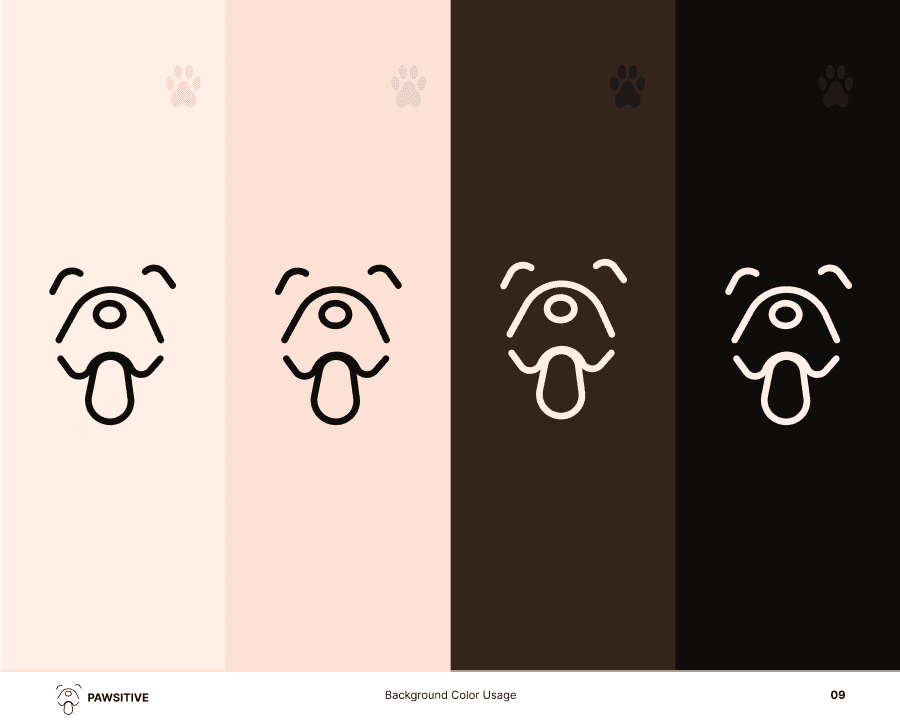
A soft, earthy palette was selected to evoke comfort and warmth.
The logo mark was carefully constructed to be scalable, symmetrical, and instantly recognizable.
Typography was chosen to maintain readability while reflecting the brand’s playful edge.
This wasn’t just about logos — it was about giving the brand a visual soul.
Challenges Identified
Branding for pet-tech requires a unique balance. Key challenges included:
Creating a cohesive identity across diverse formats (mobile, print, merchandise)
Avoiding clichés while still feeling familiar to pet lovers
Ensuring the brand remained accessible and readable in all use cases
Solving for Consistency
To solve these challenges, I built a comprehensive brand guideline that included:
Horizontal and vertical logo systems
Clear color usage rules and accessibility considerations
Logo misuse examples to prevent distortion of the brand
Grid systems and spacing guides for precise placement
Typography pairings designed for both personality and clarity
Key Design Assets Delivered
Logomark & Logotype (horizontal, vertical, mono-color versions)
App Icon System with mobile grid alignment
Color Palette (primary, secondary, soft tones)
Typography using Inter Family — clean, modern, and flexible
Business Card Templates and digital stationery
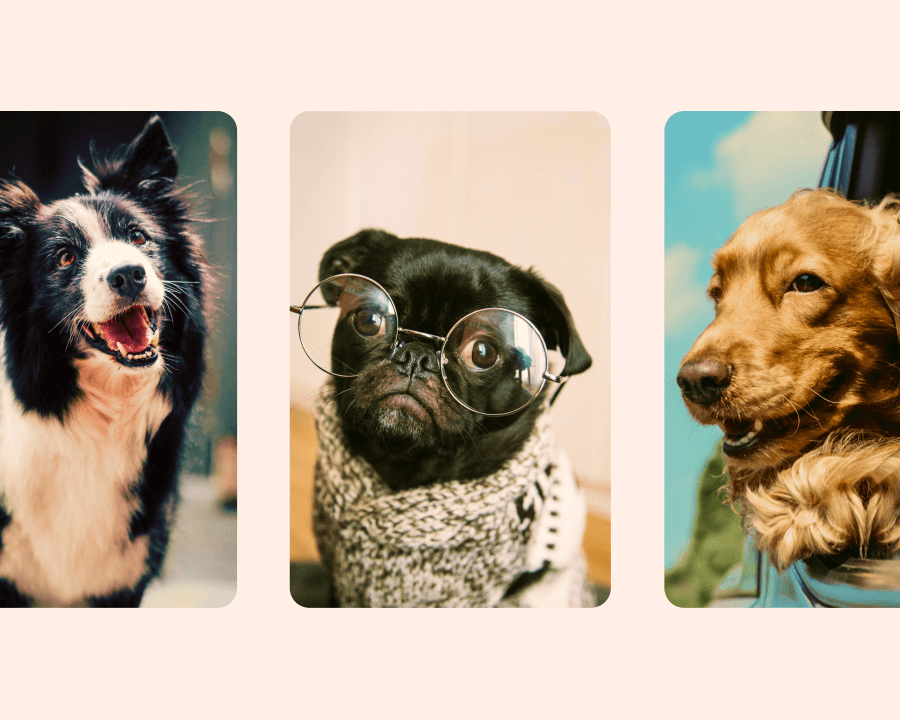
Photography & Illustration Direction for campaigns
Brand Voice & Tagline: “Bark. Wag. Love.”
Accessibility & Optimization
The brand system was built with A11y principles in mind:
Color contrast ratios tested for readability
Legible typography at all scales
Safe zones and padding rules defined for clarity in UI
Outcome
The result is a flexible, lovable, and professional brand identity that mirrors the mission of PAWSITIVE: to create a trusted space for pets and their humans. The brand now communicates with clarity and warmth — whether on a website, app, or product label.
Conclusion
PAWSITIVE's branding is more than just visual — it’s emotional. By creating a cohesive and versatile identity system, I helped shape a brand that feels as reliable as it is endearing. Every element — from the color tones to the iconography — is designed to spark trust, joy, and connection.